Michael Craig-Martin: Past Present | Cristea Roberts Gallery
Pieter Saenredam’s paintings of bracingly plain church interiors helped to define the Dutch Golden Age, artistically at least. Saenredam was a master of minimalism, taking infinite care with slightly varied shades of white on his walls, rendering the play of sunlight and shadow.
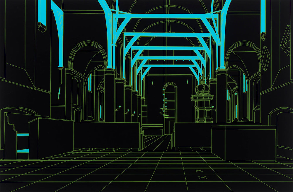
Michael Craig-Martin’s also known for his use of colour, though his palette is hard, flat and bold. In this exhibition of new works, Craig-Martin committed the (self-described) “sacrilege” of recreating Saenredam’s Interior of the Sint-Odulphskerk in Assendelft as a line drawing, then printing it in several different colourways, including this ultimate inversion - one in black.

Saenredam’s original is a painting I’ve been interested in for years - I wrote about it here during lockdown. In Craig-Martin’s black print, the form of the church is identical. But the colours are brutally flattened, and various details are simply removed, including all of the people in the church. The scuffs and abrasions from Saenredam’s tiled floor are obliterated; Craig-Martin’s floor is a pure perspective grid, like the background of an 80s video game.
This is just one of the old master works redrawn, recoloured and reprinted by Craig-Martin in this show. Each source painting is pared back. For example, the faces of the king and queen in the mirror in Velazquez’s Las Meninas are rendered absolutely clear in Craig-Martin’s print. Da Vinci’s Mona Lisa has the folds of her double chin brutally delineated. That’s because Craig-Martin’s technique depends on clear, sharp lines separating blocks of colour - but it’s also clearly an artistic statement.

“I use colour to support but also challenge the line drawing,” Craig-Martin says. “I employ a small palette of intense pure colours to give the work emotional life, visual differentiation, structure and rhythm.”
Some of the colour choices gave me a real jolt - not only the black church, but also the Smurf-like tone of Piero’s flagellated Christ (above), or the hot pink rendering of Caravaggio’s Bacchus, making the curly-headed boy look as sweet and synthetic as a Chewit.
Craig-Martin claims this flattening of form and colour is “unhierarchical”. You could huff at the chutzpah of a modern draughtsman meeting the old masters of the past eye-to-eye, and messing with their work in this way. Or you could reflect that, in this meeting, today’s artist has picked out details that are easily missed from these great works of the past, clarified and complicated them, made something new. In case it’s not obvious, I agree with the latter view.
Michael Craig-Martin: Past Present is at Christea Roberts Gallery (London). 23 September - 05 November 2022